In part 3 of this “Chronicles of a Windows user gone iPhone” series we’ll dig into more of the iOS apps that I want to use. As a Windows user, obviously most of these are going to be apps made by Microsoft so it will be interesting to see how Microsoft contributes to its competitor’s ecosystem. Of course, I’ll also look at a few other of my favorite 3rd party apps and maybe explore some of Apple’s built in apps that I’ve never used before. If you missed part 1 or part 2, you can check those out as well.
The 2nd most-used app/service for me besides email, is probably Facebook. Facebook apps on Windows Phone, and Android, and any web browser have all felt pretty similar to me. Facebook on iOS feels totally different though. It’s got a big row of unintelligible icons at the bottom of the screen and they don’t match the icons on the website! Yes, having these buttons at the bottom of the screen is much better than having them at the top where fingers can’t reach them, but unlike other iOS apps, this bottom bar of icons have no text labels and therefore I have no way of translating them into something understandable without tapping them and wasting my cognitive/muscle energy. The triangle button on a squircle looks like a “play” button, but Facebook isn’t a media player so that doesn’t make sense. It turns out that just loads random videos… so I can completely avoid that. Not sure what the dog house icon is supposed to be. Marketplace? Forget that. And why is there a bell here instead of the globe icon Facebook has always had for notifications? Now that everyone has learned what the old icons meant, it’s time to change them, huh? That’s not smart.

I’m kind of surprised at how bloated the Facebook app on iPhone is compared to other versions. I might just use the touch.facebook.com mobile website instead since that has much less extraneous junk, although it still has the poorly-placed icons at the top of the screen.
If you see a file manager, they blew it.
Okay, actually Steve Jobs said that if you see a task manager, they blew it. The reasoning behind that quote was because having to manage tasks and close applications was thought to be too complicated for normal users. People shouldn’t have to think about that kind of thing. That was in 2010 with the iOS 4 launch, but holding down the home button certainly does show a task manager now. Anyway, the same type of thought process normally has always applied to a file manager in Apple’s view. Being able to access, organize, and arrange files on your smartphone shouldn’t be necessary. Although, now with iOS 11 we certainly do have a new “Files” app.

I was expecting this to be some sort of file manager like the name implies, but really it seems to only support iCloud file storage management, and even then it’s pretty weak in terms of features. OneDrive also integrates with the Files app, but there really isn’t anything you can do with it. I found no way to add OneDrive folders as favorites or tag them or move them or anything. All I could do was browse and preview some files. The iCloud storage section does have a few basic features, but you really can’t do much here.
Skype
I’ve managed to almost completely stop using Skype on Windows due to its continued decline in reliability. On Windows, Skype is terrible at matching user-names with actual contact names, thus making a mess of conversation threads on all of my devices. It’s not essential at all, but I thought I’d install the iOS version of Skype just to see what it was like.
It turns out Skype on iOS is even worse than the Windows UWP versions. The whole point of Skype was always to see which contacts are online/available and easily be able to video call, voice call, or instant message them. Most of that is gone or obscured on the iOS app. It only has a “Chats” listing of threads with no way to see who’s online. There’s a “Highlights” section with buttons for “following” friends as if it’s supposed to be some kind of social network now. There’s also a “Capture” tab which looks like some Snapchat nonsense, so I’m sure I’m never going to use that.

Like a bad joke, if you have to explain your interface design, it’s not a good interface design.
I kind of wish Skype on iOS was more like Skype UWP on Windows 10 and allowed syncing text messages between iOS and Windows 10 devices. Unfortunately, that’s not the case as Skype on iOS seems to be having an identity crisis.
Tons of app tutorials
I also installed Cortana, OneNote, OneDrive, Groove Music, Xbox, and Microsoft Word. Most of these required a re-login of my Microsoft ID, which is understandable since this isn’t Microsoft’s ecosystem, but it’s still annoying. Another annoying thing is how many apps show introductory tutorials. If your app needs a tutorial, that means you didn’t design its interface very well. Apps like Cortana had tutorials about how to add the Cortana widgets to the iOS today screen or whatever it’s called. Sure, I didn’t know how to do it, but requiring me to read through all these instructions, memorize them, and then navigate out of the app in order to perform the procedure is really tedious and certainly not intuitive or simple.

What if there is no “apps button”?
OneDrive had a first run tutorial that didn’t even make sense. It told me to go to iMessages and open the waffle menu. There is no iMessages on this iPhone. There is a “Messages” app, but it doesn’t have a waffle menu. So there’s another user experience failure. It turns out I have to “activate” iMessages with my Apple ID in the settings somewhere (which isn’t clear at all), and even after I did that the “apps” button looks completely different from what is illustrated in the OneDrive tutorial.

FaceTime just hangs on the activation screen for some reason. There’s no error message or anything indicating why it doesn’t work. (It turns out I have to go to the settings to “use Apple ID” for this too.)
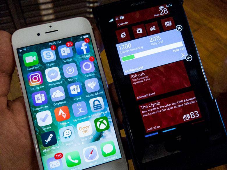
MyFitnessPal
One app that I used to use all the time on Windows Phone was MyFitnessPal. They stopped supporting it a while back and the social news feed aspect has stopped working, so I thought I’d install it on the iPhone. Turns out the iPhone version of the app is pretty terrible, although it does work. On Windows Phone, the MyFitnessPal app had voice commands, so I could actually record weight measurements using Cortana. It also had pinnable live tiles for direct shortcuts to entering data or displaying data. With one tap on the start screen I could launch the bar-code scanner and record all the nutritional information for something I was going to eat. The iOS version of the app takes 5 taps to launch the bar-code scanner! It’s a much less efficient design.

What’s with the ads all over these apps?
Outlook for iOS
In part 1, I went on about how terrible it is that Apple’s Mail app doesn’t support push syncing for IMAP accounts and one of our readers mentioned how Outlook for iOS is a really good email app for iPhones. So today I totally shut off the Mail app’s notifications and installed Microsoft’s Outlook for iOS mail app. This is basically a re-branding of Acompli’s mail app after Microsoft bought out that company and it is widely considered to be the best email app for iOS.
Of course, I’m familiar with Outlook on Windows and macOS. I’ve been using Outlook for Windows since it was first released in the 90’s. The desktop Windows version is by far the most powerful communications and personal information management tool around (followed closely by eM Client)… But Microsoft’s mobile versions of Outlook have always been stripped down and not quite good enough. Outlook for iOS is also a stripped-down personal information management app, and still not quite good enough.
I’m also familiar with Acompli’s Android version of the email client, which was also renamed to Outlook for Android, and I have to say the iOS version is much nicer than the Android version. Thank goodness there are no distracting bright-colored circles in the email listing!
Switching between email accounts is still a total pain though. Outlook for iOS lists them hidden behind a hard-to-reach hamburger button and then only identifies the accounts with a colored circle and the letter of the first part of the email address. For me, all of them are the letter A, so that’s ridiculously painful to use.

A hack to get messages organized.
I did however find a way to get my emails segregated so that I can prioritize their placement on the iPhone’s home screen. I actually ended up installing multiple email apps and set up different accounts in each one so that I could have different icons showing different email unread counts. It’s still a total pain compared to what I can do in Windows, but it kind of works. Now I can keep the spam email accounts separate from my level 1 and level 2 priority accounts. Unfortunately, the iOS icon badges all constantly show the unread number of messages even after I’ve scrolled through the listings. I much prefer Windows Phone’s method where the live tile only shows the new messages that have arrived since the last time I looked at the email app. The Windows method means I can quickly see what’s new and easily ignore the unread messages I don’t need to open without having to do anything to them.
What are some of your favorite iOS apps for use in the Microsoft ecosystem? Let me know in the comments below. If you missed part 1 or part 2, you can check those out as well.