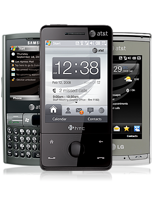
Over the years, the ways in which we interact with our mobile devices have changed drastically. In the beginning there were keypads, buttons and dials. Then came the first generation of touch devices with their now-primitive touch interfaces that were basically miniaturized renditions of desktop UIs, like Windows Mobile. This was the heyday of the phone stylus. The stylus provided a more direct and precise way of interacting with the devices, and as the Galaxy Note line of phablets shows us, can still be put to
good use.
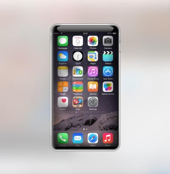
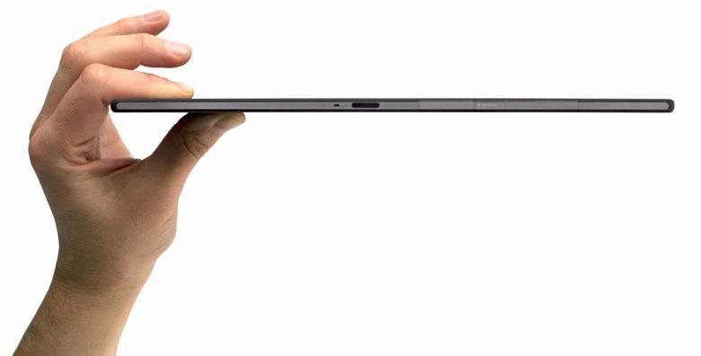
Fast forward to today, and the smart devices we use are sleeker, more portable and much more powerful than anything that was available ten or fifteen years ago. But however different the devices of today might be from the ones that existed before, there are certain things that are very much the same. These devices still have physical buttons that are tied in to certain tasks, like turning the screen on or off, and controlling the volume. Why do we still use buttons at all when it is theoretically possible to eliminate all the buttons entirely? Wouldn’t that be the epitome of the minimalistic sleek sexy smartphone?
The answer lies in one of the basic tenets of design – affordances. Affordances are the aspects of an object’s design that suggest what you can do with it. The initial generation of mobile devices had quite a few buttons – there wasn’t any particular design guideline back then and thus these first pioneering phones were based off of what was already there at the time. Thus, the buttons and dials. Phones then grew into various form factors like the clam shell and the slider, and developed specialized keypads that better suited the miniature form factor. All these physical designs helped usability quite a bit. Shutting the flap of a flip phone provided a reassuring end to a phone call. Mobile phone keypads along with T9 prediction features meant that you could type on the phone just by feeling out the keys – in certain cases without even looking. Slide out functionality, as we have touched upon earlier, provided certain tactile affordances as well.
As touch based UIs came of age, touch gestures like kinetic scrolling and pinching to zoom became more widely used, as they were natural. Touchscreens became more responsive and widely used. Back in the initial days of the mobile UI, the on screen objects were made to resemble real world objects that everyone was used to seeing – the resemblance to real world objects helped make these interfaces easy to learn. In a way these replaced physical buttons with touch buttons.
There were some buttons that were not replaced, though. Having power buttons to turn the device on or off, using volume rockers/buttons to change the volume, and to some extent having a dedicated camera shutter button on some devices are the last remaining relics of the initial era of mobile devices. Some functionality can be incorporated into software –tapping the screen to wake or turn off the display is quite handy– but there’s certain affordances that these buttons provide that can’t be mimicked by software. Buttons provide a feedback to the user, either tactile or as audio.
It is this feedback that some people miss. Some of us remember the days when we could type without looking at the phone, could scroll through lists using a dial, could flip the phone open or close, or could slide out a keyboard or even a speaker. In the end, it comes down to a tradeoff between having physical artifacts, versus having a sleek and minimal design. Buttons and jog dials take up a significant amount of physical space, which might make devices heftier. Added tactile feedback at the cost of added device thickness is not a tradeoff many of us are comfortable with.
Is there a way we can get the reassuring feedback of physical buttons, without compromising sleekness and minimalism? I think we might. As we’re seeing today, the current crop of smart devices are seeing an unparalleled level of adoption and ubiquity. The current generation is one that was born and is being raised with such devices and in turn the affordances they provide. This familiarity with the current UI paradigms, along with technological innovations, might help bring about new ways to interact with our devices.
One of the obvious ways is through sensors. Modern smart devices are laden with sensors that detect motion and ambient light among other things. A few OEMs have tried to leverage these sensors to provide interaction methods. Using gestures to scroll through menus and webpages, for example. These methods seem to be relatively easy to implement, but they just aren’t reliable enough at this stage to become popular. Remember Samsung’s “smart scroll”, “smart stay” and the bevy of features they were pushing just a few years ago? Or even the Amazon Fire Phone with its four front-facing cameras coupled with an accelerometer and gyroscope that track your face and shift what’s on the screen in an attempt to make things more “immersive”.
One of the most popular interaction methods for mobile devices in recent years, has been touch gestures. Right from the Palm Pre or Pixi, which had a gesture area below the display that helped navigate the UI, to modern smartphones that allow users to use predefined or user-defined touch gestures to open apps, navigate the UI or use services on their devices. Touch gestures are coupled with a visual feedback and at times a haptic feedback. Although interesting, these types of gestures are often viewed as cumbersome and difficult to remember.
Vibration is one of the kinds of feedback that modern smartphones do provide. Apple’s Force Touch uses this concept, simulating a haptic feedback using vibration motors. The Force Touch track pads simulate a click using this concept, and the apple watch uses a similar concept in its force touch feature. Some people liked this feature, and others like Marco Arment have noted that although it kind of feels like a click, it doesn’t mimic the feedback that a click provides completely, a case of almost there but not quite. In the next few iterations, this concept might very well be one of our best bets for proper user feedback.
Another way of tackling this problem may lie in utilizing the affordances that these sleek devices do provide. The Runcible, a device showed off at MWC this year, provides a good example. Not only is the circular display touch sensitive, but also the metal housing, as it responds to touch gestures. The circular metallic housing can be used to scroll through and navigate the UI. This is kind of like the iPod Circle, though in the case of the Runcible, the circular housing goes much farther than the iPod Circle, in terms of providing affordances and pointing out how it can be used, and comes the closest to providing a great balance between user feedback and a minimalistic design. This would have to be altered for use on a device like a smartphone, however, as the housing or the sides of a phone or tablet are generally used to hold the device and aren’t always available to use for navigating the UI.
In the age of smart devices with sleek and minimal designs, sacrifices and tradeoffs have been made. With devices becoming sleeker and thinner by the day, the few buttons that we have on smartphones these days might be the ones that go the way of the dodo. If that is to be the case, it’s only fair to ask manufacturers and designers to provide alternate methods of interacting with our devices which not only provide a minimalistic and aesthetically pleasing design, but also provide adequate user feedback.
The point here is not to dwell on the past, but to take what was good and incorporate it in some way into the future, to create truly delightful experiences. Experiences which, in this age of cookie cutter rectangular slabs, we all seek and indeed deserve. In the quest for being more futuristic, it’s often easy to completely ignore the need to be more natural. As we have seen – there is definitely a difference.


