Over on the Windows Phone user voice site, the hot topics lately have focused on the poor user interface design changes seen in Windows 10’s phone UI. Back in the days of Windows Phone 7, one of the major differentiators between Windows Phone and other smartphone platforms at the time were its design and how much thought was put into it. Everything was primarily based on typography for a good reason; people understand words. We use them to communicate practically everything all the time. We’re doing it right now. The animated interface used words and animations to communicate actions and functions. Words flew into the frame as you moved from one hub to another and then appeared cropped at the edge of your screen to indicate that there was more if you pushed it to the side. It was very intuitive.
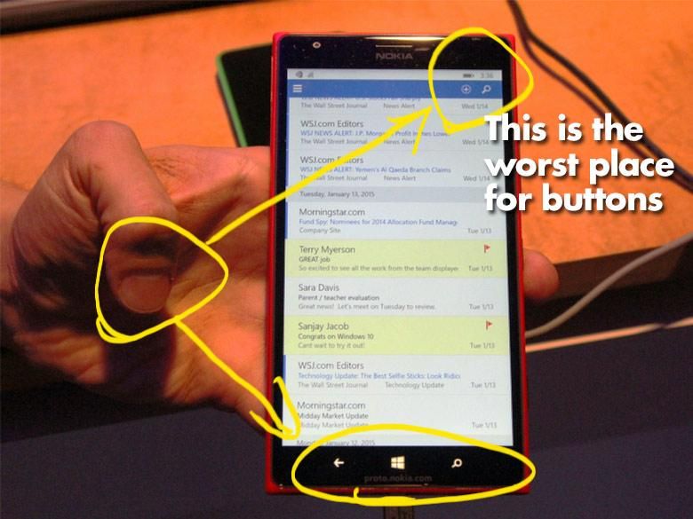
What’s more, Windows Phone 7’s interface designers actually (mostly) understood one-handed usability. The design language generally recommended putting interactive elements towards the bottom of the screen since that’s the easiest place for your fingers to reach them while holding the device. That concept of ergonomics and usability in smartphones increases in importance as the screen size gets bigger than 3.5″ and reaching buttons at the top of the screen start requiring scooting or stretching. It’s like designing a full sized car where you have to spread your legs from the right side to the left side in order to reach the gas and brake pedals. Sure you can do if you stretch or scoot side to side, but it’s certainly not ideal or ergonomic. Apple knows about the problem and they created a goofy hack that moves the whole application towards the bottom of the screen so that you can reach the top buttons. Microsoft was in a unique position to do things right, but it would seem that something changed starting with the new top-edge screen gestures in Windows Phone 8.1. Maybe the smart UI designers were transferred to different projects.
Notice how far away the mystery meat buttons are when they’re at both the top of the screen and bottom of the screen. (Image via who also notes Microsoft’s change in design philosophy.)
Below we’ll take a look at a few excerpts from the community along with links to the respective Uservoice pages that you can use to vote on as well. These are only the ones on the first page. There are pages and pages of comments from Windows Phone users deriding Microsoft’s recent user interface design changes.
Keep the “Spartan” address bar at the bottom
-
XomBolf commented · January 27, 2015 9:09 AM
Microsoft really should continue using address bars at the bottom. It’s really wonderful to use. That’s why I like the “old” Windows Phone: The menu is always on the bottom, easy to reach without trouble using the App Bar. Using Android you have to stretch your fingers to the top (often left side) to access the menu – not a good idea in my opinion. -
Anonymous commented · January 24, 2015 11:52 AM
Keep commands where the fingers are (bottom) and content where there aren’t (top)! You would put “back, start, search” buttons at the top, would you? -
Seon M commented · January 21, 2015 5:53 PM
Yes. Please. Do Microsoft test their phones for one hand use? Hamburger menu on the far left top is a night bare to reach. No more appbars with easy to reach commands. Its like everything that made windows phone a great mobile OS is being tossed out. Sighs…
Keep all the Menu/Navigation Buttons at the bottom in Windows 10 for Phones
-
Q commented · January 29, 2015 06:11
Menu/Navigation Buttons at the bottom is why I like to use Windows Phone apps.
At the top it’s just anti ergonomic -
Anonymous commented · January 28, 2015 18:48
Unfortunately, this is a done deal. Take a look at the horrible, horrible design of the Microsoft Band companion app, Microsoft Health. It’s got everything wrong: No application bar at the bottom. A hamburger menu at the top that is a complete junk drawer, containing important elements, like navigation, as well as never-used garbage like “about.” It also features TONS of wasted space, multiple taps required to do simple tasks, and, on some screens, a software back button! Unbelievable but true. -
Anonymous commented · January 28, 2015 18:41
It’s not just a mistake. It’s an idiotic, moronic, gutless, revolutionary blunder. It proves that Nadella and BelFiore don’t give a rat’s patoot about design or productivity. They think they can copy bad Android design and fool people into liking Windows phone that way. So, a bad copy of a copy of iOS. If we wanted bad design that yields horrible UI, we’d just go where the apps are: android
Stick to Modern, don’t copy Android
-
Alan commented · January 23, 2015 1:18 PM
With the recent Windows 10 announcement, we have seen two troubling UI changes: no more “pivot control” options, no more “panorama control”, and eliminating (or a mixture of) the round app bar icons.Instead, we are seeing the “hamburger” menu icon become prominent among universal apps, and in baked in OS features. Android is a huge user of this method.What made Windows [Phone] stand apart was pivot control, panorama control, and the easy to identify and use round icon buttons. Microsoft should immediately restore these features (it is understandable that a “hamburger” menu option would be good for some apps, however).1) Pivot control (and Panorama control): Let’s start with the mail app, now being replaced by Outlook (?). With the current app, I can very easily and quickly find my unread email, flagged, or all. Now I have to stretch my thumb on my Lumia 1520 to get to a hamburger menu to do this. Way too many steps. Panorama control also is fantastic because it breaks with the “same old thing” iOS and Android use for navigating an app. With Panorama, it’s a smooth seamless easy to use app. Now, I’ll have to be taken to different screens. 2) Round icon buttons: By far, this is my favorite UI feature of Windows Phone (and Modern Windows in general). Coming from Android and iOS which have a mixture of icons, these round icons on Windows were very easy and fast to identify (instead of “thinking” if they are an icon, etc…even if that takes a few milliseconds). Looking at some of the new icons/buttons on Windows 10 (while understanding this is still a “preview”), not having the round icons makes an inconsistent and unclean look whereas the round icons would be consistent, clean, polished, and evenly spaced. You can even see in one of the screenshots with notification toasts where you can reply to a message, there is a “paper airplane” “send” button, which is not featured in a traditional Modern Windows “round” icon, but just a huge icon. It looks cheesy, unclean, and out of place. A round modern icon button would look more professional.While this topic by Ivan started about Windows Phone and the OneDrive app, we are seeing a continuing trend by Microsoft of regression in the face of Android. Windows/Windows phone should not destroy what makes it unique and…hear this Microsoft: PRODUCTIVE…but keep these elements. Can they be tweaked a bit? Sure. But just copying Android is not the right UI/UX move to make at all. -
Ticc commented · October 28, 2014 06:38
Stay true to Microsoft design. Others are already changing to what you have.
Buttons to down, not use “hamburger”
-
Anonymous commented · January 24, 2015 1:30 PM
Please keep this MS. You have no idea how much I love the “…” At the bottom. It just feels so natural to pull it up instead of a hamburger menu at the top. -
Ryder commented · January 23, 2015 6:26 PM
Seriously, what is Microsoft doing? They have gone from complete innovation with a fantastic design aesthetic that was both original and completely functional, to some hacked together mishmash of ideas half borrowed from the competition. The OS is what sold me with it’s panorama and pivot menus. I wish we could go back to the purity and ease of use present in WP7. Users have applauded the design of the phone UI time and time again, only for MSFT to completely destroy it and alienate the existing user base with a less functional and less appealing reiteration of the OS with each new release. MSFT stick to the original design intent. -
LLPO commented · January 21, 2015 5:39 PM
The metro/modern UI was a triumphant achievement for Microsoft. Don’t let it go to waste with awful design, stick to the original principles! Windows 10 app guidelines should not allow hamburger menus and high buttons!
Move navigation bar back to the bottom in Windows 10
-
TroyS commented · January 24, 2015 19:09
Navigation needs to be back to the bottom – Look at the taskbar in WP8.1 WP8, WP7, W8.1, W7, XP and further… all our main nav is at the bottom.
Example of irritation… When you manually select to check for app updates, in Store you open the epilates go to Settings > Check for updates, then the notifications screen pops up at the top then you must scale to the top of the screen to select Ok (then of course you need to go back to the bottom again to select the back icon). Probably bad example, and I just tolerate it, but when the main Back, Home and Search buttons are at the bottom of the screen, and the taskbar is at the bottom.
Need consistency -
Pavel commented · January 23, 2015 18:23
As it has been said before, the navigation bar on the top is big design issue, very inconvenient on the current generation of smartphones where 5″ screen is an average size. Personally, I prefer the old 3 dots as they are less visible than the hamburger icon and allows the bar height to be fairly low and not disturbing. -
Thomas Krieing commented · January 23, 2015 07:19
Yes for sure Apple has this problem and Microsoft means to go the same miserable way. Microsoft have you ever heard anything about ergonomics?
Conclusion
The lack of apps doesn’t seem nearly as important to current Windows Phone users as the clean, understandable, easy-to-use interface does… and oddly, Microsoft appears to be messing up the interface aspects that made it so much better than other mobile device platforms. I’m sure Microsoft wants to make all of its software much more consistent across a wide range of platforms and that’s why they’re adopting their competitors’ user interface conventions, but what good is that if their competitors are doing things badly? Instead of following the bad practices that users are becoming used to, shouldn’t Microsoft start leading like they have been with things like Xbox, Azure, Kinect, and HoloLens?


