Okay, alright, I apologize for the harsh headline. Random rainbow circles in your email isn’t going to cause a global nuclear war, but it is going to reduce your productivity if you use email as a business tool (and if you don’t, you should be.) If you’re using Windows 10 on a desktop/laptop/tablet or Windows 10 Mobile on a smartphone, you may have noticed on March 3rd the Outlook Mail and Calendar apps were updated. Now your email listing has a randomly colored circle next to the person’s name for each message and the user’s initials are inside the circle. The bright colors draw your eye to the meaningless letters as if they were the most important thing in the world. Naturally some colors are more eye-catching than others, so your eye is going to be drawn to those more and since the colors are applied randomly, Outlook Mail is probably going to draw your attention to email and initials that really aren’t important at all.

Why is “DR” now the most important element in my email?
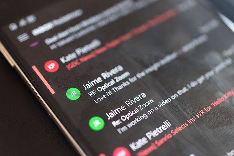
In the above screenshot you can see the letters “DR” are now the most important visual element in the listing. That’s not how it should be. By default, the most important thing should be overdue flags, then the person’s name, then the unread status. The flags are so faint in this design that it’s very difficult to see the actually important emails.

Android probably started this nonsense.
These random rainbow circles may look familiar if you have an Android phone. The Gmail app has them all over the place, but thankfully there is an off switch in that app. The Android version of Outlook (which used to be a 3rd party email app) also has the random rainbow circles in email. Bringing that to Windows 10 was probably an attempt at consistency, but it’s still bad design… and it’s especially bad design for a mobile phone where screen space is much more limited. It’s actually pretty surprising that Microsoft brought this idea over to Windows 10 from Outlook on Android since it has such a huge amount of negative feedback associated with it already. The “Remove Avatars” Outlook for Android Uservoice thread is still getting many comments and upvotes after 2 years.
Without the random rainbow color circles, the email listing did appear very boring and bland. However it’s possible to add color in a meaningful way that’s actually useful and contributes to productivity. Just ask anyone who has used the desktop version of Outlook and its conditional formatting views. Or, you can even look at the new Outlook Calendar app for Windows 10.

Categorized appointments appear color coded in Calendar!
Windows 10’s new Outlook Calendar app actually does use color in a meaningful way. With the March 3 update, it now syncs categories and their associated colors as you’ve already set up in Exchange Server, Office365, or Outlook.com. I’ve been using categories to organize and color-code appointments, emails, contacts, tasks, notes, and journals for decades in desktop Outlook and having that in the UWP version of Outlook Calendar is a huge advantage. It allows me to manage the visual hierarchy of my calendar very efficiently! As you can see in the above screenshot, each color means something different with the brightest color categories being most important. Then the shaded fills denote the free/busy status. After I’ve learned what those colors mean, and I should know since I set them up decades ago, then it’s very easy to see what’s important at a glance. That’s the opposite of Outlook Mail’s new use of random color circles which often apply a huge amount of visual importance to things that aren’t important at all.

With conditional formatting in Outlook 2016, I can easily visually prioritize emails.
If you’re an x86/x64 full Windows 10 user, the solution is easy… buy and use Outlook 2016 instead. For many decades, Outlook has been the personal information management tool of choice for people that need to get things done. One of my favorite features is the customizable conditional formatting views. In my personal email account, I’ve set pink and green colors for emails that are the most important, then blue for the next most important, etc. In my business accounts I have a similar visual hierarchy based on clients and categories. My overdue flagged emails get a bright red color to make those show up as most important. My dad has set up his Outlook to make important emails have a very large font so they take up two normal rows and thus are even easier to see. Outlook’s color coding is a bit more complicated than picking up the category color since a single email could have multiple categories applied. Being able to control the visual hierarchy in my email listing is extremely useful though. If Outlook Mail for Windows 10 can’t read my custom conditionally formatted views that are synced with Office 365 servers, at least it could read the categories like the Calendar app does. Another option would be to apply colors specified in the People app and default all recipients not in my contact list to an easy-to-ignore transparent default avatar. Really those avatar circles are unnecessary though and the colors should highlight the person’s actual name. Putting a big red circle around the letters “DR” doesn’t mean anything, and “DR” could represent any number of people in my contact list. It’s a really poor way of identifying people.
Maybe it’s true that for some people email should be a fun toy sprinkled with rainbow colored Skittles and colorful sunset background photos, but for many it’s a business tool that needs to help us work efficiently. On smartphones, that need is sorely unfulfilled on all platforms, so there’s a big opportunity for Microsoft to make a really good smartphone version of Outlook targeted towards businesses. Unfortunately, Outlook Mail for Windows 10 Mobile still doesn’t have basic email functionality needs like Draft folder sync or even reply/forward status sync for IMAP.
If you’re using Windows 10 a good place to add your feedback about this is the Feedback Hub here. If you’re an Outlook for Android user, you’ll find lots of feedback here.