It’s easy to be overly critical of Samsung. The company is larger than some of its biggest competitors several times over, and it has the man power, resources, and know-how to not make some pretty obvious mistakes over and over again.
We’ve reamed Samsung more than once for shipping substandard products with laughably awful software and performance optimization. TouchWiz UX, for example, has shipped on dozens of Samsung products over the years. It’s not only long in the tooth, cluttered, and … ugly, it is some of the most poorly optimized Android software we’ve ever dealt with time and time again.
A full-screen notification shade with individual notifications nearly stretching the entire width of the display, seen as recently as the Galaxy Note 10.1 2014 Edition, is silly and reminiscent of the original Galaxy Tab from 2010. Even the stock Android notification shade for tablets had been update by Google multiple times since then, which means Samsung was physically going out of its way to “un-optimize” the shade.

But that’s only one of the countless complaints we’ve had about TouchWiz since the early days of Android. I could go on and on, explaining what we hate about the current state of TouchWiz. But that horse is long dead, and there’s no sense in beating it anymore.
Or is there?


Last week at CES, Samsung uncovered its brand new (sort of) tablet interface, dubbed Magazine UX, something we’ve all been begging for. At first glance, it looks pretty nice. But is Magazine UX something to get excited for? Or is it just more of the same?
We managed to get some hands-on time with the tablets in Las Vegas, but the devices were preproduction demo units and we’re not certain it was final software. Not only that, we only had mere minutes to breeze through the new UI and look over spec sheets. So I reserve my final opinion until I have an extended look at Magazine UX. But I already have a pretty good idea of how I feel about the new tablet UI.
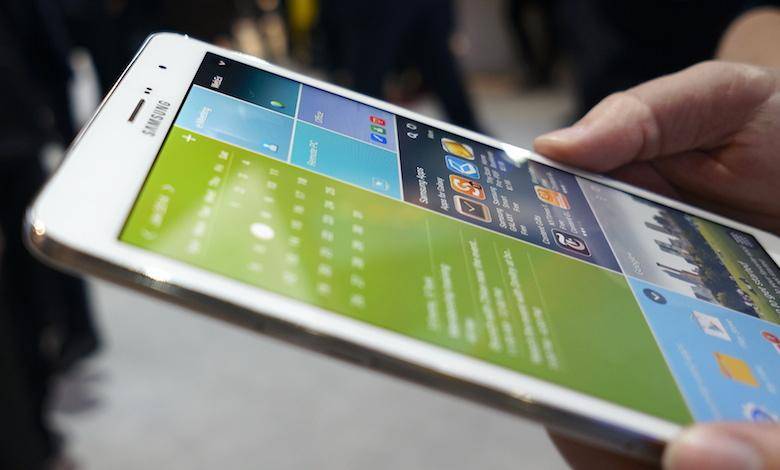
The main home screen is still the same, old TouchWiz interface we’re used to seeing – room for icons, folders, widgets, and the like. Swipe in either direction, however, and you will meet the new Magazine UX. Within each page, there are up to six user-customizable tiles, where things like favorite applications, news, and S Planner tiles can be rearranged and auto-resized to fill the display.
It didn’t take long after Samsung’s unveiling of the mildly refreshed UI for people to start making some comparisons with the new interface. People have called it a Flipboard knock-off and a rip-off of Microsoft’s Modern UI, Chameleon Launcher, or practically anything else tiled or magazine-like.

Admittedly, Magazine UX – from its name to appearance and functionality – is pretty unimaginative. But forget about all the other interfaces, and try to look at Magazine UX in a vacuum.
Is it attractive? More so than the TouchWiz interface before it, but it’s hardly the most gorgeous interface I’ve ever seen. Although the Magazine UX interface has been flattened some, it’s like an extension of the cartoon-like interface from TouchWiz, only much more expansive and organized.

Further, does it properly utilize the display real estate? Certainly better than before. The spaces provide a ton of glanceable information straight from the home screen, or what Samsung refers to as “zero-click access.” It handles rotating orientation much better than the native Android and TouchWiz UIs, no thanks to the harsh resizing of widgets from a landscape to portrait grid. It also scales really well from one screen size to another.
Best of all, it brings some much-needed polish to the Samsung tablet experience. In the time period we were able to use the new Galaxy TabPRO and NotePRO models in Las Vegas, the new UI was fluid and responsive – a big improvement over the lagfest TouchWiz had become.
Let’s be clear, though. TouchWiz is still very much present, whether Samsung chooses to acknowledge that or not. It’s fixed the atrocious notification conundrum and tweaked a few UI elements throughout the system. But at the end of the day, Magazine UX is just another layer on top of TouchWiz, and performance issues could arise on the varying models.
At the end of the day, Magazine UX is a step in the right direction. But once again, it’s only another half measure from Samsung, a bandaid over a widening gash, instead of the major surgery which is actually needed. The problems with Samsung’s software and device performance clearly extend much deeper than the appearances of TouchWiz. While Magazine UX does a nice job of disguising the antiquated UI of TouchWiz, it is nothing more than a little concealer.

Samsung fails to see the bigger picture in the UX situation: less is more. And TouchWiz needs more than just a pretty skin. It needs to be gutted, optimized, and given a face-lift from the ground up. Adding another element to already cluttered software is not the answer.
Magazine UX is … pretty. But it’s boring, uneventful, monotonous, and nothing truly new. While I won’t complain about a tablet-optimized interface on some compelling hardware, I will close by saying this: if Magazine UX is Samsung’s answer to all the complaints about TouchWiz, its ride at the top of the mobile industry could be a short one.