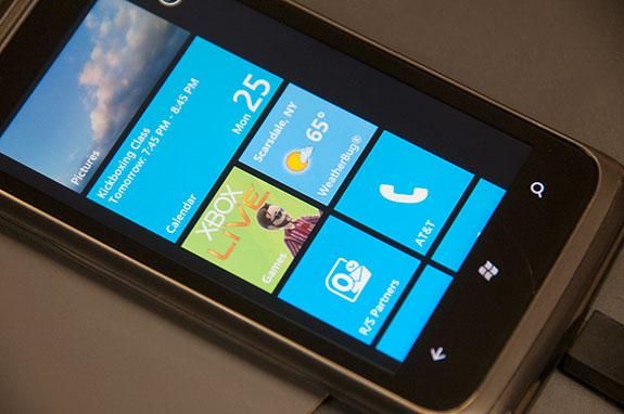
Is that a widget, or a Live Tile on your screen? Back in the early days of Windows Phone, Microsoft’s homescreen was basically just a grid of “flat” icons, but unlike Apple’s grid of “dimensional” icons, Microsoft’s could be updated to give you real-time information. If you had email, the Live Tile would tell you how many were waiting to be read. Apple’s email icon did too, but Microsoft carried that concept across every app. The tile for the clock app would tell you the time. The tile for the weather app would show you the weather. But it went further than that. The tile for Facebook showed you what your friends were sharing. Your photo tile bought your pictures to your homescreen. It really was quite novel and unique.
Except that it wasn’t that novel, and other than the fact that the tiles were generally flat boxes of a solid color, they weren’t that unique either.
Live Tiles vs. Widgets
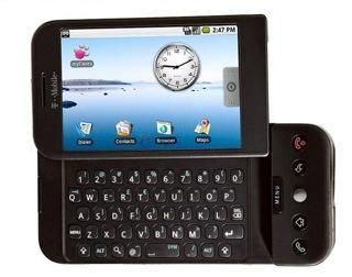
Android, from the very beginning, brought app shortcuts (icons) and widgets to the same screen. They could live together wherever you wanted to place them, and they all sat on top of a user-configurable wallpaper.
And that’s the way things were for quite some time.
According to Google, “widgets are an essential aspect of home screen customization. You can imagine them as ‘at-a-glance’ views of an app’s most important data and functionality that is accessible right from the user’s home screen. Users can move widgets across their home screen panels, and, if supported, resize them to tailor the amount of information within a widget to their preference.”
According to Microsoft, “a tile is an app’s representation on the Start screen” which allows a developer to “present rich and engaging content” to you, the user. Tiles come in different sizes from which you can choose and dynamically resize. Tiles, like widgets, can be “live” (updated through notifications) or they can be static (essentially just an icon or shortcut into the app). Unlike Android, you can toggle between the two without having to remove a shortcut and replace it with a widget (or vice versa).
For the most part, Live tiles have typically been text only, or a stylized graphic on a boldly colored background. Some tiles had different colored backgrounds, and a few had “graphical” components. This was by design and served to unify the experience a person had when using Windows Phone.
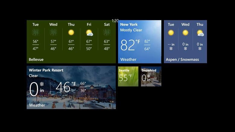
But there were always outliers. Images and contacts, for example, were represented with pictures — and rightly so, but that broke from the norm. Back in October of 2010 we showed off the Weather Bug app that brought some “live” weather information to your home screen, since then, not a whole lot has changed. Well, not until recently.
It seems that over the last few months, apps have been updating the look and feel of their Live Tiles to be much more graphical and interactive. Even Microsoft’s own Bing apps have gotten into the game — specifically with weather and sports. Yes, some apps looked more widget-like than others in the past, but the trend is now moving away from monochromatic tiles that Windows Phone has become famous for, and is moving to much more visually appealing and picturesque imagery. I can’t say I’m disappointed. Live Tiles are clearly becoming more like Android widgets, and that’s a good thing.
Now, what’s it going to take to get Apple to adopt widgets?
Sources: Android Developers, MSDN


