Hamburger buttons have been seeing a lot of controversy recently, especially with Microsoft piling them into all of the new universal Windows apps that it’s been developing for Windows 10 both on desktop PCs and phones. Many people already know what’s wrong with them, and as some of my Twitter followers might say, “anyone with eyes can see how bad it is.” There have been many usability studies that show how hamburger buttons can greatly reduce and impair user engagement. Apple hates them and Google has started moving away from them (they’ve been removed from the Google+ app), but Microsoft has started embracing them.
There have been a lot of articles lately about a particular ex-Microsoft UI designer (Jragon on Reddit) who has been publicly defending the use of hamburger buttons. He left Microsoft a year ago and most of his conclusions are based on usability study data that’s probably from back when the hamburger button first started seeing some use. It sounds like Microsoft’s decision to go all-in with hamburgers might be kind of a “skating to where the puck used to be” scenario. Maybe the Android and iOS users out there are used to this kind of bad design, but they might smarten up soon when they try to use their phones more efficiently. Anyway, let’s look at what’s wrong with the hamburger button.
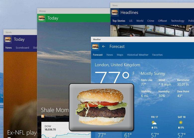
It’s called a hamburger button

Burger King uses hamburger buttons correctly.
If users have to make up silly names to describe button designs, then that’s a user experience failure. Every time you call it a hamburger button, you’re insulting that designer’s ability to create something that properly communicates its function. The only time a hamburger button should be available in a program is if it actually has something to do with hamburgers. For example, the Burger King website gets a free pass to use the hamburger button because we’re talking about hamburgers there. Remember the “start button” in Windows 95? We called it the start button because it had the word “start” on it and that’s where you were supposed to begin your navigation of the operating system. That made a lot of sense! In the same vein, on Mac OS, Apple always uses a button that looks like an apple which contains menu commands related to apple recipes, growing apples, and eating apples.
It doesn’t work as a junk drawer
Ex-Microsoft UI designer (Jragon on Reddit) contends that it’s okay to use the hamburger button as a junk drawer to store rarely used commands and navigation items. Maybe that’s true, but Microsoft certainly isn’t following that convention. If you’ve used the Windows 10 preview on a desktop PC or phone, you’ll notice many important functions are hidden behind the hamburger button. Things like switching between email accounts and email folders are more difficult than ever. Even if you’re not using the Windows 10 preview, you can see how difficult it is to find your Xbox Live messages in the Smartglass app for Xbox One. They’re buried in the hamburger button and you can’t even see an indication of new messages when you launch the app.
It’s vague and unintelligible
Three horizontal lines? What does that mean? Nobody knows. Sometimes it means something that you can drag like a scroll-bar. Sometimes it means you’re going to apply justification to a paragraph of text. Sometimes it means there’s a hidden menu of items that will pop out below it. Sometimes it means a hidden menu of items will pop out from the side. Sometimes it means a hidden menu of items will pop out above it. What could possibly be available within this hidden menu? Nobody knows! It’s completely impossible to predict. We don’t even know if it’s always going to be a menu of hidden commands. There’s very little consistency.
If you can’t make a button that’s 100% understandable by everyone, then you need to use a text label (the best icon is a text label). The fact that we need to call it a hamburger button means it’s obviously not understandable, and numerous tests show that users generally do not understand it. Many interface designers have been moving to the ellipses menu icon which Microsoft pioneered in Windows Phone 7. The “…” menu is a bit more recognizable since that’s a standard symbol in most Romance languages that means “more” or “pause there’s more coming”. It’s even found in the Japanese language, I believe.
If you’re going to invent new languages that people need to learn in order to use your software, why not do it right? Create a standard set of symbols, give them an consecutive order, create pronunciation guides for them, create a dictionary that defines them, design instructional training books that people can use in schools, etc. Make it “open” so that everyone can use the same language in their interface design.
On Mac OS X, the hamburger button switches the Finder to “details” listing mode.
We already have a symbol for “menu”
Maybe the three horizontal lines is meant to be the new universal symbol that indicates a hidden menu is available. Well, we already have a symbol like that which everybody already understands. It takes up about the same amount of space as those three big lines, too. All you have to do is combine four letters in the alphabet to spell out the word “menu” and you’ve got a button based on a word that people can read and understand. We can call it the “menu button” and when somebody tells you to tap the menu button, you can find it by reading the word “menu”. Life would be so much easier if we all had a standard set of symbols and sounds to communicate with, wouldn’t it?
Its location is usually at the top of a smartphone’s screen
In general, when you’re holding a phone, the middle and lower parts of the screen are easiest to reach with your thumb. That’s the best place to put buttons that the user needs to interact with. The upper part of the screen is the best place to put things that the user might need to see and read. Bottom half is for input (that’s why the keyboard is down there), top half is for output. It’s really awkward watching someone with a large phone try to press those buttons at the top of the screen while holding the phone with one hand. There are some major hand and finger acrobatics required to do that. It’s not efficient at all.
Some will say that people are okay with using a phone with two hands. I’ve been on the NY subway many times, and everyone there is using smartphones. Frequently it’s necessary to use it with one hand, and frequently that’s very difficult due to the interface design that has become commonplace to put buttons in very awkward, hard-to-reach locations.
Conclusion
There was a time when computers were very easy to use and learn. I clearly remember web browsers with text labels for all of the buttons and even customizable interfaces that you could adapt to your own workflows for increased efficiency. With smartphones, that’s no longer the case, and with Windows 10 it looks like that inefficient bad design is creeping into the desktop operating systems that we rely on for getting things done. Mobile phones were once much easier to use, too. For the majority of their lifespan, phones had buttons at the bottom where your thumb was located and a screen at the top where you could see things. Now that they’re all screens, people seem to have forgotten how to make things easy to use, and the hamburger button is just one example of that.
Also see:
- Kill the hamburger before the hamburger kills you
- A button that has the word “menu” is clicked 20% more than a hamburger button
- The hamburger is bad for you
- Why and how to avoid hamburger menus
- Apple says don’t use hamburger menus on iOS
- Time Magazine had to launch a tutorial pop-up explaining the hamburger menu
- Why we banished the hamburger menu
- Hamburger buttons could be costing you half of your user engagement
- Hamburger Menus and Hidden Navigation Hurt UX Metrics