Google is giving the search experience on mobile devices some aesthetic upgrades. Actually, the changes are quite minor, but they are said to retain the familiarity aspect with Google’s signature design language while also making tweaks such as updated font, more subtle use of colors, and putting the important information at the center so that users can easily find it. Starting with the font, it will now look similar to what you see by default on Android devices and across products such as Gmail, adding a dash of consistency to the whole design language.
Bigger and bolder text in a familiar Google font
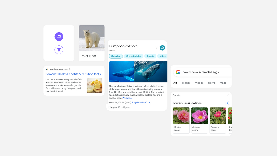
“It’s about simplifying the experience and getting people to the information they’re looking for as clearly and quickly as possible,” said Google designer Aileen Cheng who led the design refresh initiative. Coming to the fresh Search experience on mobile, users will come across bigger and bolder text that is easier to read and understand the importance of each element. Here’s a side by side comparison of the new vs old search experience on mobile:

Being referred to as ‘a new edge-to-edge results design’ for Search on mobile devices, Google’s design team is also cutting down on the use of shadows, allowing the content to take center stage rather than making users struggle to find the main information. “They weren’t quite right, though, and ultimately the team focused on centering content and images against a clean background and using color more intentionally to guide the eye to important information without being overwhelming or distracting,” the blog post added.
Overall, it appears that the new search experience for mobile devices is focusing on introducing some design consistency and reducing distracting elements to put the useful information easier to find – without sacrificing the familiarity aspect of Google Search, that is. The new design language for Google Search on mobile will start appearing for users in the coming days.

Image: Google