As people all around the world struggle with a global health pandemic, Google Maps has made a few improvements lately to help users adjust to this new normal and find helpful information. Recently, Google Maps introduced alerts from local transit agencies about travel restrictions, eligibility rules and guidelines for visiting a testing facility, and crowdedness predictions for public transit stations. Now, Google Maps is adding another useful tool in the form of a feature called COVID layer that will help users identify if an area is safe enough to travel depending on the severity of virus outbreak.
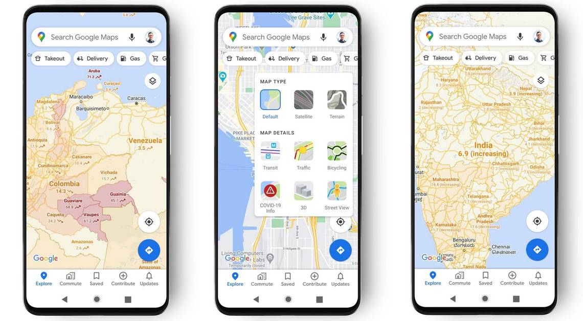
When you open Google Maps, tap on the circular layers icon in the top-right corner and select the “COVID-19 info” option from the tray. Once you do that, Google Maps will show a seven-day average of new COVID-19 cases per 100,000 people in each area. Additionally, an arrow graph or tag (“decreasing” or “increasing”) will show if the number of cases has gone up or reduced in each area. And to make it even easier, Google Maps will color-code each area to better explain how badly an area has been affected, with a darker shade of red representing a dangerously high pace of virus outbreak. The new Google Maps feature has already started to roll out on both Android and iOS platforms.
COVID layer is based on data from authoritative sources
Google says that the COVID-19 trend data is available on a city-level basis for all 220 countries where the service is accessible. Talking about COVID-19 infection rate data, Google says it uses information from authoritative sources such as Johns Hopkins, the New York Times and Wikipedia, which in turn get their data from the World Health Organization (WHO), government health ministries, as well as state and local health agencies and hospitals. Google says that the dataset used for creating Google Maps’ COVID-19 layer feature is the same one that brings up useful information in search.