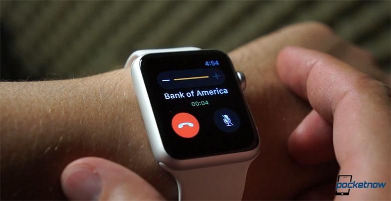
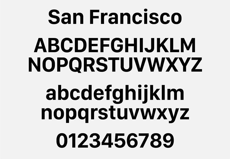
Apple had to spend a lot of time thinking about its user interface when dreaming up the Apple Watch, and one of the decisions it ended up making concerned the introduction of a new font. Rather than stick with the Helvetica Neue that’s the current system font for both iOS and OS X, Apple chose a typeface it calls San Francisco for the Apple Watch font, a version of which you can see below. Intended to be extra legible at even small sizes, San Francisco made plenty of sense for the smartwatch’s tiny screen, but a new rumor claims the font will be finding a more prominent role on larger devices, too, as it becomes the default font for iOS and OS X.
While there’s reportedly some push-back within Apple, with not all engineers loving the idea of moving away from Helvetica Neue, word is that Apple wants to transition to San Francisco for both iOS 9 and OS X 10.11.
That may not be a done deal, though, and these sources also indicate the possibility of Apple delaying the font for further-out OS releases, or even backing down from the change entirely. And while it sounds like a lot of work to adopt all this existing software to look good with a new font, it makes a fair degree of sense for Apple to have a consistent look across its various form factors; it may just be a matter of time before iOS and OS X find themselves forced to catch up with Watch OS.
Source: 9to5 Mac


