Google is giving the old Android TV UI a fresh design makeover via an update that borrows some elements from the Google TV interface which arrived with the new Chromecast late last year. Actually, the new Android TV layout looks a lot like the Google TV design that puts the focus on aggregating content from multiple platforms in one place.
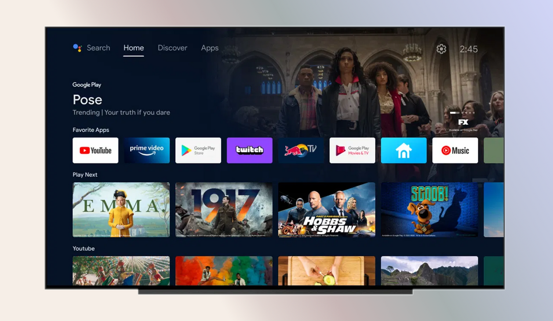
The fresh Android TV interface has a side-scrolling carousel of content at the top that looks a lot cleaner and makes better use of space. The side column with three huge icons on the left has been removed in favor of a horizontal text-based toolbar at the top of the screen. You’ll now the Search tool, and buttons for Home, Discover, and Apps neatly arrange in a single row.

As the name suggests, the Apps section is where you will find all your media consumption applications, while the Discover tab will give you personalized movie and TV show recommendations based on your viewing habits. On the other hand, the Google TV home screen offers a total of six tabs – For You, Live, Movies, Shows, Apps, and Library – at the top, alongside the search tool.
The Home tab on the updated Android TV interface is further divided into multiple sections such as a Favorite Apps bar, a Play Next carousel below it, and a separate YouTube section sits underneath it as well. The most noticeable change, however, comes to the Discover section, which essentially does the same thing on Android TV as the For You tab on Google TV.

In the Discover section, you’ll come across a ‘Top picks for you’ section at the top, followed by a ‘Trending TV Shows’ and ‘New movies and shows’ carousels below it. The new look for Android TV will start showing up for users in the US, Canada, Australia, Germany, and France starting today, with a wider rollout set to commence in the upcoming weeks.
For the sake of comparison, below is a short video that highlights Google TV’s UI in all its glory: