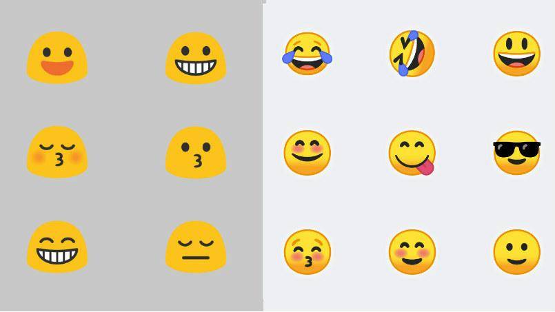
The ubiquitous yellow smiley face. It’s been around since time immemorial in pencil and inklets, but only began to be prominently associated with the sunny color mere decades. And that circular face was around for all of it. That was until Google decided, “you know what? Our emoji need to be a little more abstract than they already are. Let’s make them blobby.”
They ended up more like gumdrops in shape when they launched on Android 4.4, but it’s what we used and saw on our Android devices for a long, long time when it came to the Unicode Consortium’s standard for faces.
Well, if you’ve turned onto the Android O beta for your eligible device, you’ll have noticed a radical change to the emoji keyboard — gone is that original flat twist and in are circles, pure and simple. The circumferential mascots have been on the drawing board for 18 months.
Google’s Creative Director Rachel Been told Fast Company about how the infamous “blobs” were leading to miscommunication in everyday messaging.
“If I sent my friend the dancing woman on iOS, and I’m on an Android device and I see a blob, there’s a miscommunication,” Been said.
A complete redesign of official emoji is now in place with new symbols from the Unicode 10 standard being put into the works. Delineating curves receive bold strokes to help elements stand from each other in complex icons.

Of course, as we’ve seen with how the Unicode Consortium decides on what ideas get their place in the shorthand language, there are some quizzical debates as to how a burrito or women in STEM fields should be depicted in Google’s design.
“Emoji is a balance of symbolism and actual representation of the real thing,” says Gus Fonts, product manager for Android.
Check out the source bar below for a link to the full Fast Company story. You can look forward to these designs going official once Android O does, probably mid-August or so.