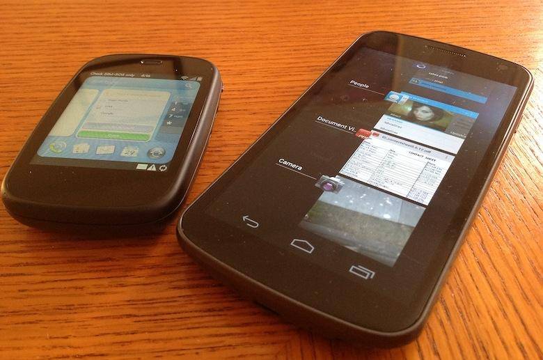
I was talking with Brandon Miniman the other day about the Android task switcher. Because that's the kind of conversation you have when you're a phone geek, and it's awesome. Anyway, we weren't talking about the modern Ice Cream Sandwich implementation, with the ribbon of cards and the dedicated multitasking button; we were talking about the Gingerbread-and-below multitasking approach. You remember the one: if you wanted to call up your last-used apps, you could hold down the home key, and a box containing them would appear. For a while, this box only contained four six of your most recently used apps; with Froyo, it got a boost to eight. Gingerbread kept the number the same, but changed the box background to jet black and implemented some shading to separate it visually from the rest of the OS.
Despite these visual improvements, though, the core functionality remained unchanged for a long time: the multitasking interface played the part of the Windows Task Manager on a PC; long-pressing the home key was akin to the Alt+Tab combination. The interface even resembled a PC-style approach, with its dialog-box presentation.

Then, along came Ice Cream Sandwich. Android 4.0 was in many ways a ground-up rethinking of Android's look and feel, right down to the system fonts the OS employed. One of the most visible changes was in the multitasking interface; Google ditched the dialog-box list approach entirely, replacing it with a vertical ribbon of cards representing recently-used apps. Users could scroll vertically through their list of apps, and could remove apps from the launcher by swiping them off the screen to the right or left.

If it sounds familiar, it should; the Ice Cream Sandwich multitasking method is a twist on the "cards" interface pioneered by Palm with webOS, and since used on other platforms like the BlackBerry PlayBook and HTC Sense 4.0.
I'm not here to complain about the wholesale poaching of this idea from webOS. In fact, the Android implementation is more legitimate than any of the other imitators in a very real sense: it came from Matias Duarte. Now Google's head of user experience for Android, Duarte once headed the team that designed much of webOS, so it's not surprising that he "ported" a few of his ideas to his new employer's product. When I first heard about the incorporation of this interface method into Android, I was optimistic. Maybe, I thought, some of Palm's ideas could make Android more usable.
And that's happened: Ice Cream Sandwich is the first version of Android I've actually enjoyed using on a daily basis. But that's not because of the multitasking screen. In many ways, I find it to be a half-baked shadow of its former (webOS) self. And though I've reflexively defended it since buying a Galaxy Nexus to use as my daily driver in January, I found myself only half-disagreeing with Brandon when he said he found the Android multitasking ribbon "useless." Here's why.
It's An Afterthought, Not A Core Element

In webOS, Palm designed an intuitive, fun, easy-to-use OS. It did this by placing a feature that was historically hidden and difficult to use -the task manager- at the core of the user experience. The task manager was the home screen. Returning to the home screen meant returning to the task manager, to card view. If an app wasn't in focus, a user was either looking at a blank desktop (if no apps were running) or he was looking at cards. They were almost always there. This made it very easy to adapt to the webOS way of doing things.
That ease of use and utility doesn't translate to a system that only employs the cards every so often. A dormant Android phone, with no apps in focus, is showing a home screen full of icons and widgets, with no indication of what's running in the background. Calling up the multitasking ribbon is a separate action. Stock Ice Cream Sandwich makes this convenient by calling for a separate, omnipresent softkey permanently docked in the lower-right corner of the screen, but not all OEMs follow this convention. On the last two phones I reviewed, the Sprint Samsung Galaxy S III and the Huawei Ascend P1, the multitasking key had been shown the door, replaced by a menu key. Calling up the multitasking interface required a time-killing long-press on the home button, something an inexperienced user wouldn't likely figure out on his own unless his last phone ran Gingerbread.
So its nature as an afterthought, a tacked-on addition rather than a core feature, gives the ICS card ribbon a handicap from the start. But there are even worse offenses in its implementation.
It's Full Of Lies
Cards in webOS weren't just screenshots of an app's state; they were active, live windows into what an app was doing in the background. With the exception of PDK apps and a few other outliers, Many webOS apps would continue to update their states even in card view, allowing them to be used as a kind of "poor man's widget." This was especially handy when hopping quickly between apps, using information in one to complete a task in another. There were exceptions to this; developers had a choice whether to allow the cards to continue to display active information or not in card view, but many did.

That's not the case in Android ICS. Cards in the ribbon are just static screengrabs of an app's last state. The multitasking card portraying the Google Play Store on the Atrix HD next to me is showing a bunch of apps updating, even though that task was complete hours ago. The card version of an app is just a fancy static icon, nothing more.
Furthermore, swiping the apps off the launcher doesn't always close them. In webOS, tossing a card off the top of the screen was more than just a satisfying way to end an app experience; it was a reliable, intuitive means of closing the app. In most cases, throwing a card away meant the app was closed. Gone. Done.
Android doesn't work that way. Sometimes, clearing an app from the task list will close the app, and sometimes it won't. It didn't take much searching to find a thread over at StackExchange explaining this issue, but the answer, a quote from Android software engineer Dianne Hackborn, reveals just how complex Android makes this process:
Actually, removing an entry in recent tasks will kill any background processes that exist for the process. It won't directly causes services to stop, however there is an API for them to find out the task was removed to decide if they want this to mean they should stop. This is so that removing say the recent task of an e-mail app won't cause it to stop checking for e-mail.
It makes sense, of course, for a core app like email to continue performing needed background tasks even when it's been dismissed from the task list ... but this inconsistent experience isn't confined to core apps like those. As Hackborn says, it's up to the app to decide how much of itself it wants to close down once you swipe its card off the ribbon. So how each app behaves is dependent on its own whims. Sometimes the app will close and sometimes it won't. You can force close it by long-pressing on the app's card, but again, that's not something apparent to many users. And it's not at all intuitive.
It's The Little Things

webOS was far from perfect; it was full of bugs and shortcomings, and it was at times a very frustrating platform to use. But card view was a stalwart. Very rarely did the task switcher, the core element of the OS, have any problems. Even when apps were bugging out and lag was making menus impossible to open, card view could be counted upon to stay easy and fun to use- at least, from 2.0 onward.
Android has that going for it: ICS and Jelly Bean's multitasking screen isn't unstable, nor is it truly "defective" in the literal sense. It's just inferior in intuitiveness, and it lacks the joy of its webOS progenitor. The vertical list of large, static app icons is more cumbersome than the horizontal workspace/desktop paradigm of webOS. The 90-degree rotation hasn't done it any favors in usability, either; swiping cards off to the side isn't difficult, really, but it doesn't come as naturally as dismissing them vertically. Delving into anything truly useful from the app switcher requires a long-press, possibly the worst of all interface choices. And it produces a clunky, two-choice menu list that only provides one useful option; the other is merely a stand-in for the swipe functionality.
The multitasking button itself is sometimes an annoyance; for the first four months I owned this Galaxy Nexus, the button carried with it a delay, a split-second stutter in calling up the multitasking ribbon. That wouldn't be a problem if it were an occasional thing, but when it happens on every button press, it's a real impediment. In a comparatively lag-free OS like Android 4.0, a stutter like that in one feature makes me want to avoid using that feature.
Am I still happy to have the new multitasking interface in Ice Cream Sandwich? Yes. I prefer it over the dull, predictable dialog box of previous generations. And hopefully future upgrades beyond Jelly Bean will bring us a task switcher that's more dynamic and fun to use. But for now, its hobbled nature and halfhearted implementation severely impair the usefulness of what could be -and, in another life, what was- a compelling, awesome feature.
Do you miss the days of Android's old task-switching dialog box? Do you wish the ribbon were more functional in ICS? Or is it exactly what you want in a multitasking OS? Let us know in the comments below, before we swipe your card away!
ICS multitasking image source: LaptopMag
Dianne Hackborn quote: StackExchange
Update: Thanks to Simon Belmont in the comments for a couple minor corrections.
Update 2: Thanks to Hedami for some clarifications on webOS multitasking.
