When Google showed off its vision for Material Design at Google I/O last year, it was a refreshing UI overhaul, the biggest change to the core aesthetics of Android since 4.0 Ice Cream Sandwich. With its vision, Google promised a refreshing new way of looking at the user experience. Dynamic and vibrant, with its bold use of colors and seamless transition animations, Android would finally be “beautiful and delightful”.
Now, a few months down the road, Android Lollipop has been released, and with it came Material Design. It was new, it was refreshing, with its pretty animations and its colors, but the more I used it, the more I saw myself looking back to the original vision shown off at Google I/O- and I have to say that it’s not quite what they had promised.
Let me make one thing abundantly clear- I really like the way Android Lollipop looks and feels, and I really believe the redesign, the biggest one since Android 4.0 Ice Cream Sandwich- brings a lot to the table in terms of responsiveness and aesthetics. Ever since it was shown off last year, I and a lot of Android aficionados out there couldn’t wait till we had the latest material design goodness on our devices. We gobbled up the developer previews, and by the time the final build was out, when some of the sheen had worn off, and we were all accustomed to the vibrant new UI refresh, we began to spot some errors and some oversights, in both the way it looked and the way it worked.
Now that Android 5.1 is ready and rolling out, a lot of the major pains seem to have been addressed – like the ability to dismiss the heads up notifications without having them disappear completely, but there are some things that are still fundamentally confusing or completely missing, and as a fan of the Android OS and a student of UX design, what was once a sight for sore eyes is now just getting to be a bit of an eyesore.
Greater customizability and control at the cost of added confusion
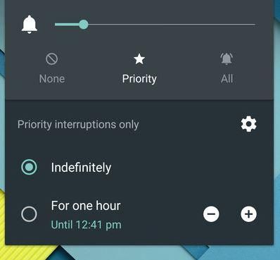
Beginning with general usability, coming from Android 4.4 KitKat, there are a few changes that were made to the way certain things operate, for example the extremely polarizing new sound management features. While it really is cool to have a more detailed way of adjusting sounds with the silent and priority notification modes, the way this change was thrust upon users is a bit disorienting. While before it was easy to put a device into complete silence mode just by pressing the volume down button, I now have to unlock the device, select the silent option, and then the duration. Pressing the volume down button only puts the device into vibrate mode. Added to that, if I have a music app or some sort of media playing in the background, I can’t access the system sounds. Why can’t I just have a toggle for silent mode like I used to?
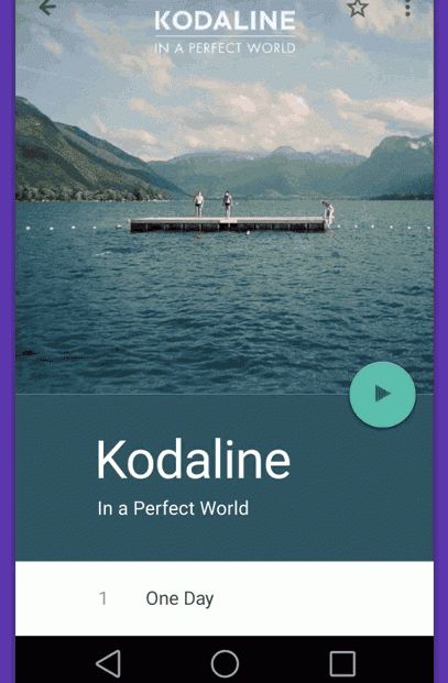
Speaking of media, remember the beautiful transition in the Google music app they showed off at I/O? It’s nowhere to be seen, along with a lot more beautiful effects they showed off. Lollipop is beginning to look like a good ol’ bait-and-switch, isn’t it?
Google did away with lock screen widgets completely in Android Lollipop. For me this is a bizarre exclusion. Perhaps not many people found a use for the feature, but to exclude it completely in favor of a supposedly “cleaner” lock screen interface to me is a step back. While we’re on the topic of lock screens, I remember having a hard time getting used to the new lock screen when I used Lollipop for the first time on my Nexus 7. I always seemed to accidentally open the camera. When I thought about it I realized that I was so used to the lock screen ring area and the direct visual feedback it provided to me, the new approach towards unlocking seemed a tad bit disorienting.
But it’s still so vibrant and lively, right? Not quite. The guidelines provided by Google seem to favor large areas of bold color, but the colors themselves seem borderline tacky at times. From the troubling teal/turquoise of the calculator, to the obnoxious traffic cone orange on the status bar when I turn on battery saving mode, it seems that giving the user some indication of the system status was mistaken by the designers as blinding my eyes with some random color in terms of vibrancy. Not to mention the overabundance of white in many of the UI screens, which a lot of my AMOLED loving friends do not appreciate, for the impact that it has on their battery. Why not give the user s some choice in terms of color schemes? I’m glad some OEMs have theming engines.
Lollipop’s animations, ripples and waves, and transitions, all aimed at giving the user some direct visual confirmation of every activity? At times it seems like I’m waiting for animations to complete before I access anything at all. Like a PowerPoint presentation with way too many effects added on to it by an overzealous office user, they sometimes give the impression of making the process of using apps and switching between activities “slow”. And yes, I know I can change the animation scale to 0.5 or less, but despite that, it seems to me like the people who designed these animations loved their work so much that they wanted the users to see what they made, and this focus on the transitions rather than the main tasks themselves sometimes takes away from the overall experience.
Which brings me to the rolodex-style app switching carousel. I had a great time using it, the delightful infinitely scrolling app cards were pleasing, but the older simple ribbon was much faster. In landscape mode, these cards still scroll vertically, which wastes a lot of space. And it’s not like the floating app cards in this carousel give me more information about the apps they represent- it’s just the same way of app switching with a shiny new wrapper around it. I really like HTCs grid layout and the live app previews of Blackberry OS.
In my ROM flashing days, I experimented with a lot of task switching methods, including pie controls. With the average screen size of smartphones increasing, a feature that allows the user to operate a ginormo-phone one handed would have been really appreciated. I believe Google missed an opportunity to include one handed usability options on Android Lollipop seeing how it would have logically gone along with the unabashedly large Nexus 6.
Minimalism isn’t always pleasing.
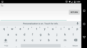
The more I dig into the OS, the more I fail to understand the logic behind the “paper” metaphor. Take the stock Android keyboard for example. They decided to do away with horizontal and vertical lines for separating keys, and made the keyboard look like someone wrote a bunch of letters on a blank sheet of paper. Google also did this in the dialer. Rather than a beautiful interface that provides only the right amount of information at the right time and in a responsive way, Lollipop looks and feels like a magazine, or rather- perhaps a scrapbook, a showboat of an OS, content with strutting its stuff.
Lists or Grids- make up your mind!
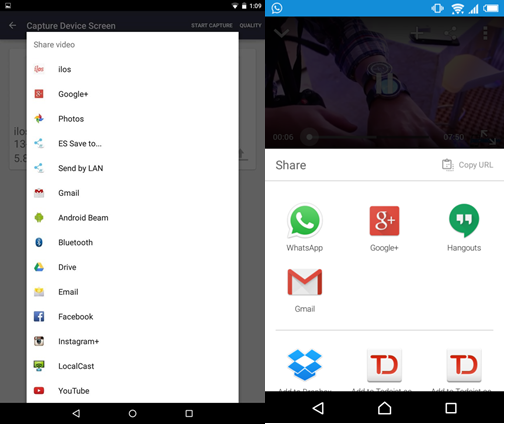
Which brings me to my next point- UI inconsistencies. Google has given extensive guidelines as to how they want these elements to be designed. But Google itself doesn’t seem to be able to decide on how to do certain things. Take sharing options for example. Sharing options are seen as a list on some apps, and as a grid of icons on other apps.
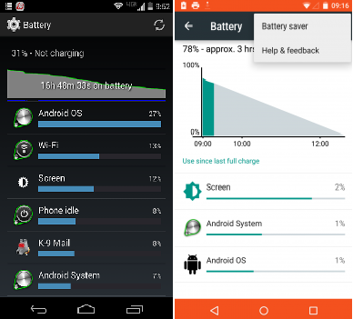
When I go to the mobile data options, I don’t have the ability to set a warning for data usage. This is a bit of an annoyance for people with fixed bandwidth caps. The battery stats screen used to show the number of hours since last charge- now it’s left for the users to find out for themselves by looking at the axes on the graph.
Is this new refresh “better” than before, on an objective level? A year ago, I would have said yes, without a doubt, but the more I see it, the more it seems like this is in many ways, a collection of all the current trends in design. It focuses so much on being new and different that it incorporates sweeping changes that may not always be more efficient or easier to use. It may seem that I’m ranting and raving about some very menial issues here. Although these things seem trivial on the surface, they are issues that really impact the way we use our devices. If Google continues to move forward like this, steamrolling the good things, sweeping them under a thick asphalt carpet, will Android really be the best user experience, or just the “Google Experience”?

