Google Chrome icon got updated after 8 years
Google is changing the icon of its highly-popular web browser Chrome for the first time in eight years. Google Chrome's new logo "align with Google’s more modern brand expression" with the company customizing the logo for each operating system it has an app on. Elvin Hu, a designer that works for Google Chrome, offered a deep dive on Twitter behind the new logo design.
https://twitter.com/elvin_not_11/status/1489647023410212869
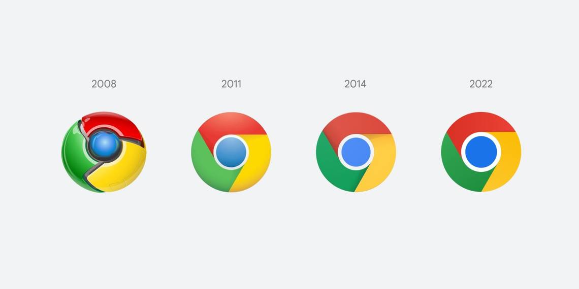
Google first redesigned the logo in 2011 when it made the original 2008 logo flatten. It further modernized the logo in 2014 by removing all the 3D designs left in the logo. And now, after 8 years, Google is again redesigning the icon of Google Chrome.
If you look carefully, the 2022 Chrome icon has dropped all the shadows between the red, yellow, and green in the outer rings that were part of the icon. Thanks to the "flat colors" used, Google did add a "subtle gradient to the main icon to mitigate the unpleasant color vibration" that existed between the green and the red rings.

Source: Twitter
The logo will also differ depending upon your OS. "We tailor Chrome’s experience to each OS, with features like Native Window Occlusion on Windows, day-one M1 support on macOS, Widgets on iOS/Android, and Material You on Android. We want our brand to convey the same level of care," said Elvin Hu.
- For example, on Windows, the icons take on an obviously gradated look, appearing at home on Windows 10 & 11.
- On macOS, they look 3D. For Beta and Dev, we applied colorful ribbons to them.
- On ChromeOS, they use brighter colors without gradients to match the looks of the rest of system icons.
According to Hu, we'll start seeing the new Google Chrome icon "in the next few months."
Via: The Verge